Ory AB
Description
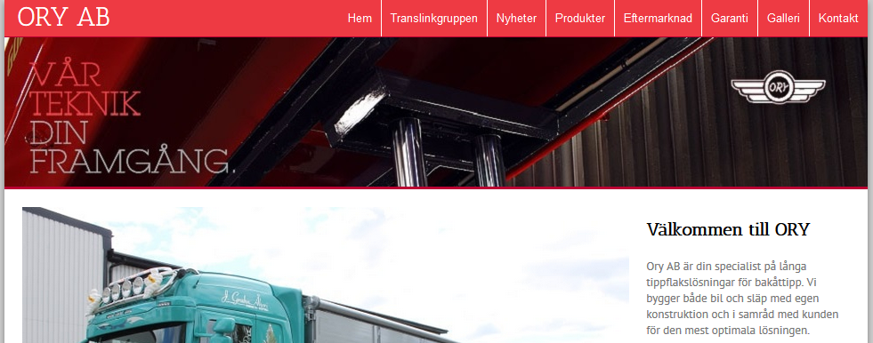
Website I designed and created for Ory AB (update: no longer the website I made. They’ve switched to WordPress now), a company that manufactures trucks and trailers. The website was built in modern HTML5 and CSS3 with a material-design-inspired card-style design, and some JavaScript for things like the carousel and the lightbox.
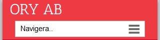
Responsive webdesign
Having a webpage that works across all common device sizes is more important now than ever as Google Analytics shows users visiting the website with phones made up over 40% of visitors, even before Ory had a mobile-friendly webpage.
What is it?
Responsive design means that you serve the same content to all devices, and use CSS (usually with the help of media queries) to ensure that it looks great everywhere.
Examples
The navigation


Technologies used
Things I learnt
- WebKit
does notdidn’t handle flex minimum width correctly. - Masonry-style layouts are fairly easy to do with CSS columns.
- How to generate an image gallery from a folder full of images automatically* in Jekyll.
- Scraping a website to get images, titles, and descriptions for an image gallery using Python.